
City of Almena Logo — Contest Winner
This logo was created for the City of Almena as part of a public logo design contest, where my submission was selected as the winning design and awarded a $250 prize. The goal was to create a timeless, meaningful identity that reflects Almena’s history, landscape, and community values.
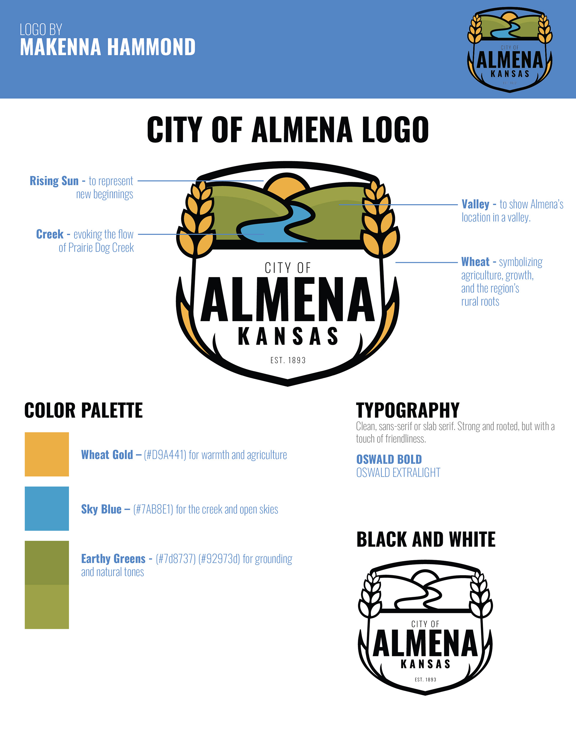
The mark incorporates key local symbolism: wheat represents agriculture, growth, and the region’s rural roots; flowing elements reference Prairie Dog Creek; the valley shape reflects Almena’s geographic setting; and the rising sun symbolizes new beginnings and a hopeful future. Together, these elements tell a cohesive story about the city’s past, present, and forward momentum.
The color palette was carefully chosen to feel warm, grounded, and approachable. Wheat gold for agriculture and heritage, sky blue for water and open skies, and earthy greens for balance and connection to the land. Clean, strong typography (Oswald Bold and ExtraLight) was selected to feel rooted and dependable, while still maintaining a friendly, modern character.
This project showcases my ability to translate community values and local history into a clear, versatile visual identity that works across color, black-and-white, and long-term city branding applications.