
Opossum Point Farms
I was commissioned to design a logo for Opossum Point Farms, a homegrown brand specializing in homemade jam and salsa. The logo was created as a surprise gift for the client’s mother, who wanted a playful and personal design to feature on her product jars.
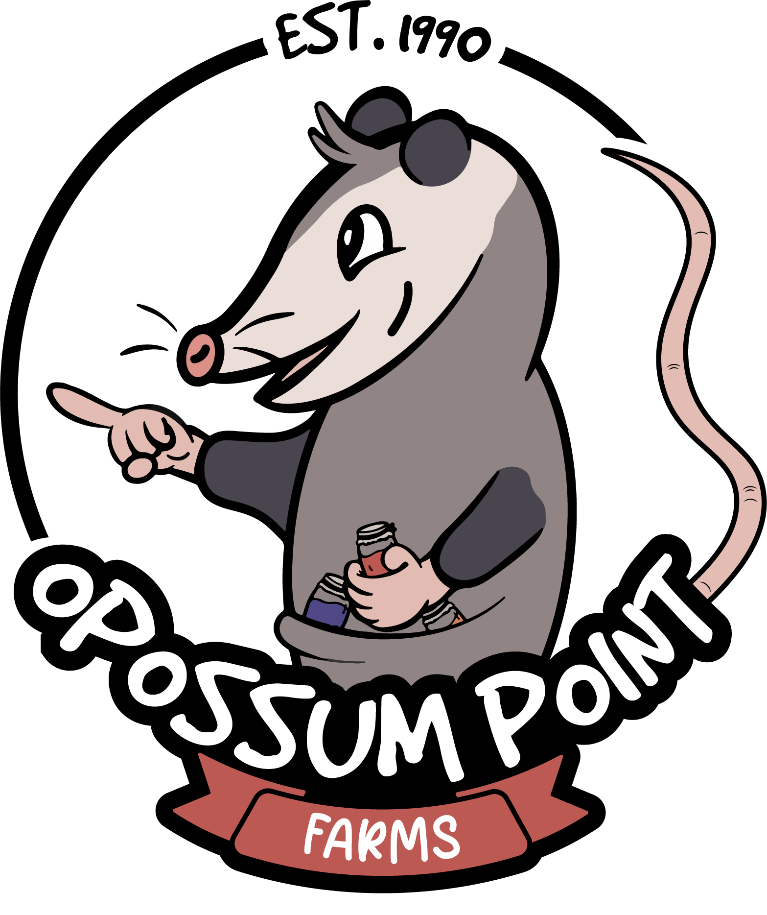
Her only request? It had to include an opossum, pointing with one hand, holding a jar of salsa.
Since the logo would be printed on round stickers for jars, I opted for a circular layout to ensure easy application and visual balance. I began with pencil sketches to explore character poses and compositions, ultimately developing a concept that captured both charm and clarity.
I illustrated the opossum in Procreate, carefully crafting a friendly yet quirky expression. Once the illustration was finalized, I moved into Adobe Illustrator to polish the design, refine the layout, and ensure scalability across print materials.
The result is a unique and personal brand mark that adds warmth and character to every jar, while remaining clean and functional for packaging.
On the right is the initial draft. I know... he looks scary. He was discarded, and I adopted a new approach, which led to the creation of the opossum, which is the logo.
