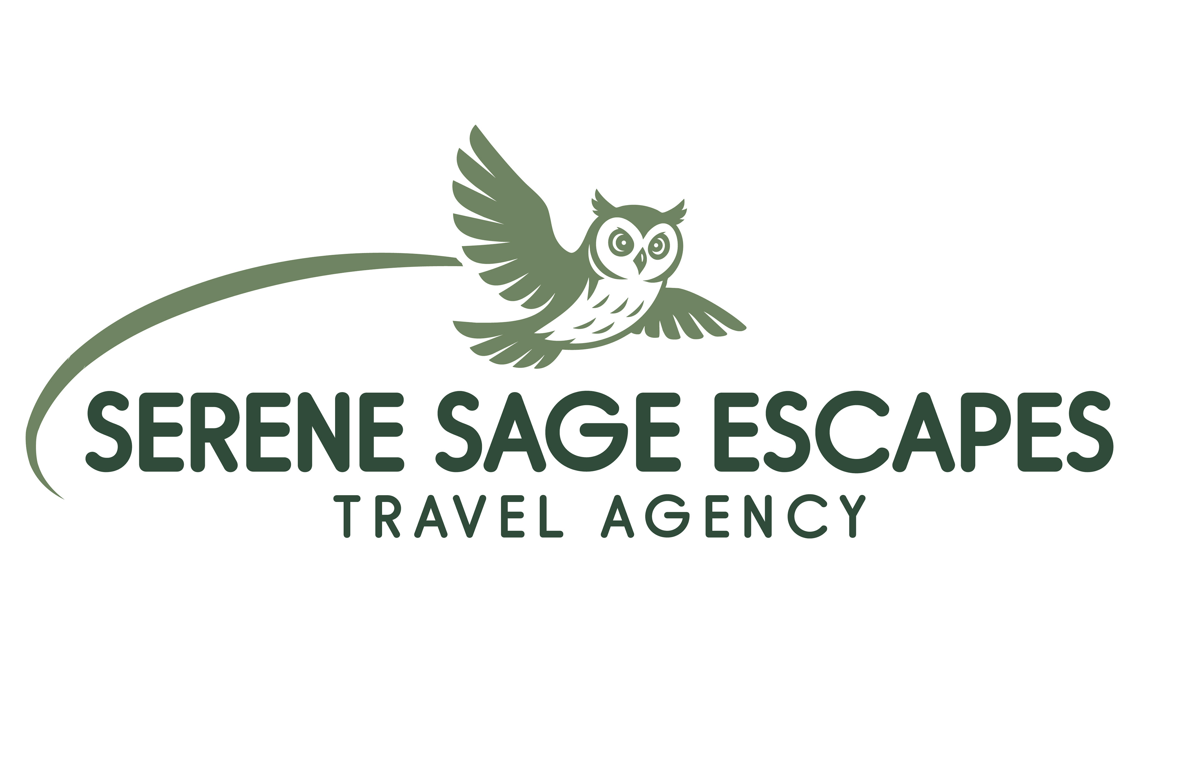
Serene Sage Escapes – Logo Design & Brand Identity
Serene Sage Escapes is a travel agency in the early stages of establishing its brand. The owner approached me to create a logo that captured the essence of her vision—serenity, adventure, and natural exploration—with a sage green color palette. Her initial requests included the use of a compass, a wave element, and optionally, an owl.
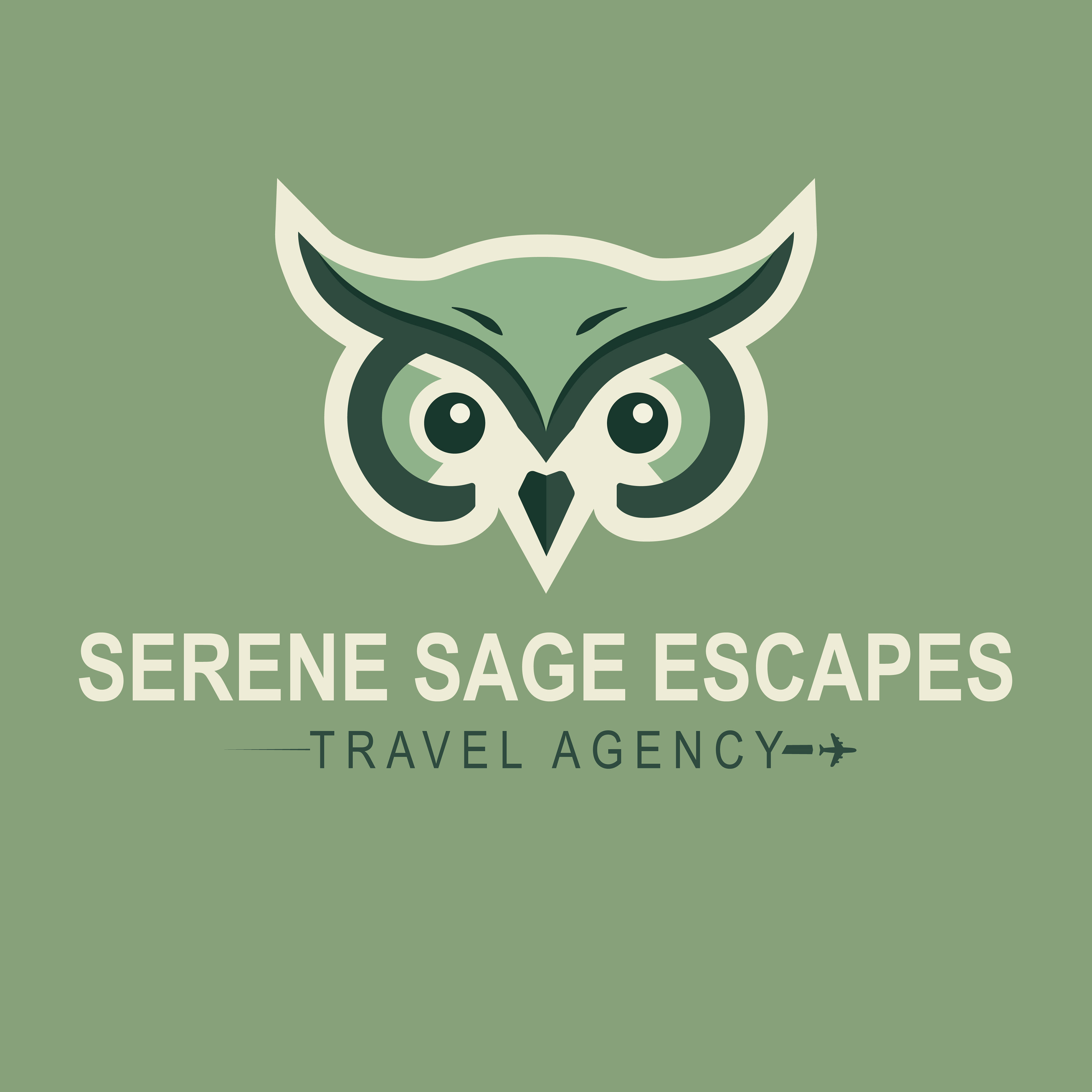
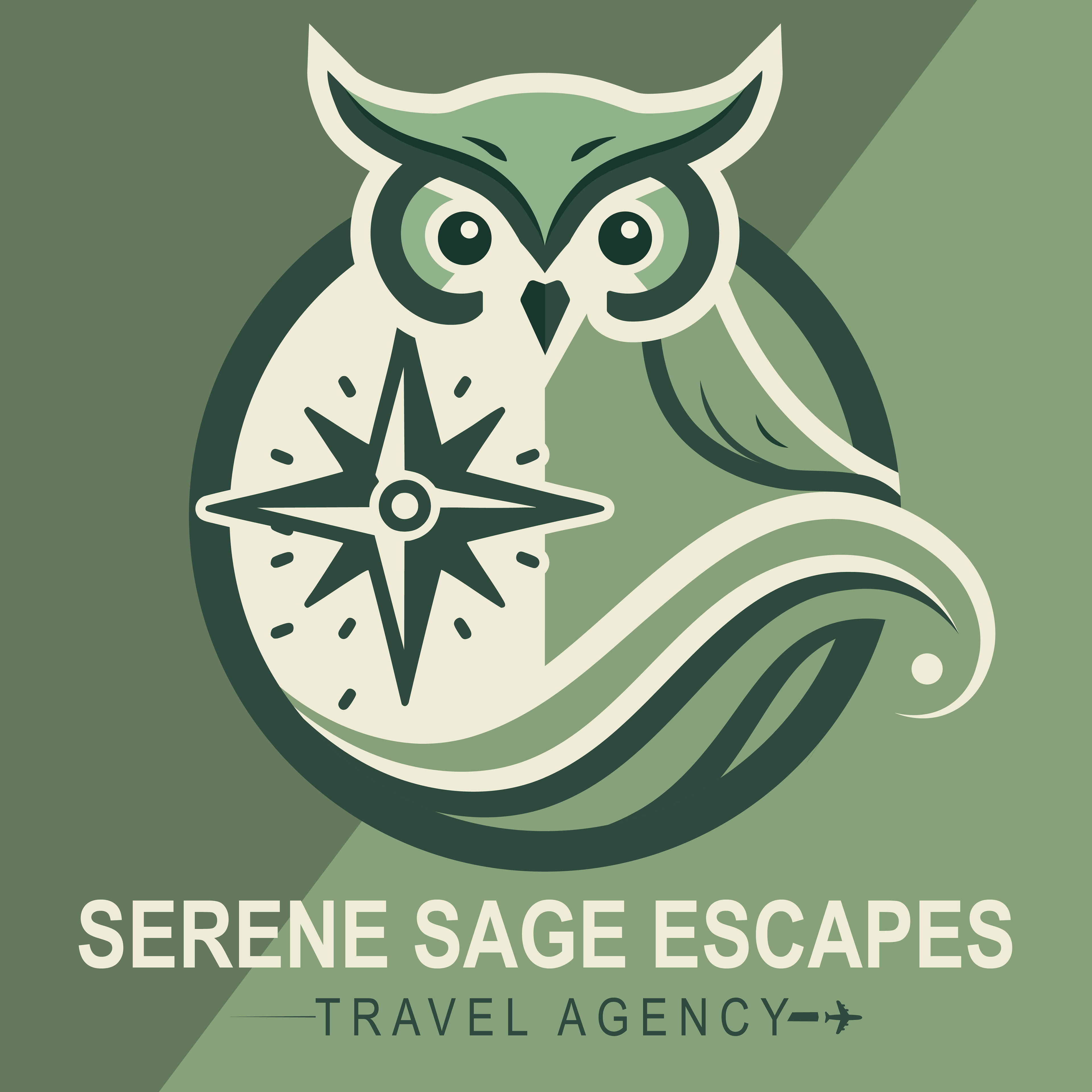
To begin the design process, I researched owl species and discovered that snowy owls are among the most widely traveled in North America—a perfect fit for a national travel brand. I included this symbolism in my initial concept development, presenting two distinct logo options: one focused on strong wave elements, and another with a clean compass-based layout.
The client appreciated the color palette and favored the aesthetic of the second option, but she loved the wave design from the first. She also requested a shift away from the snowy owl and toward a rounder typeface.
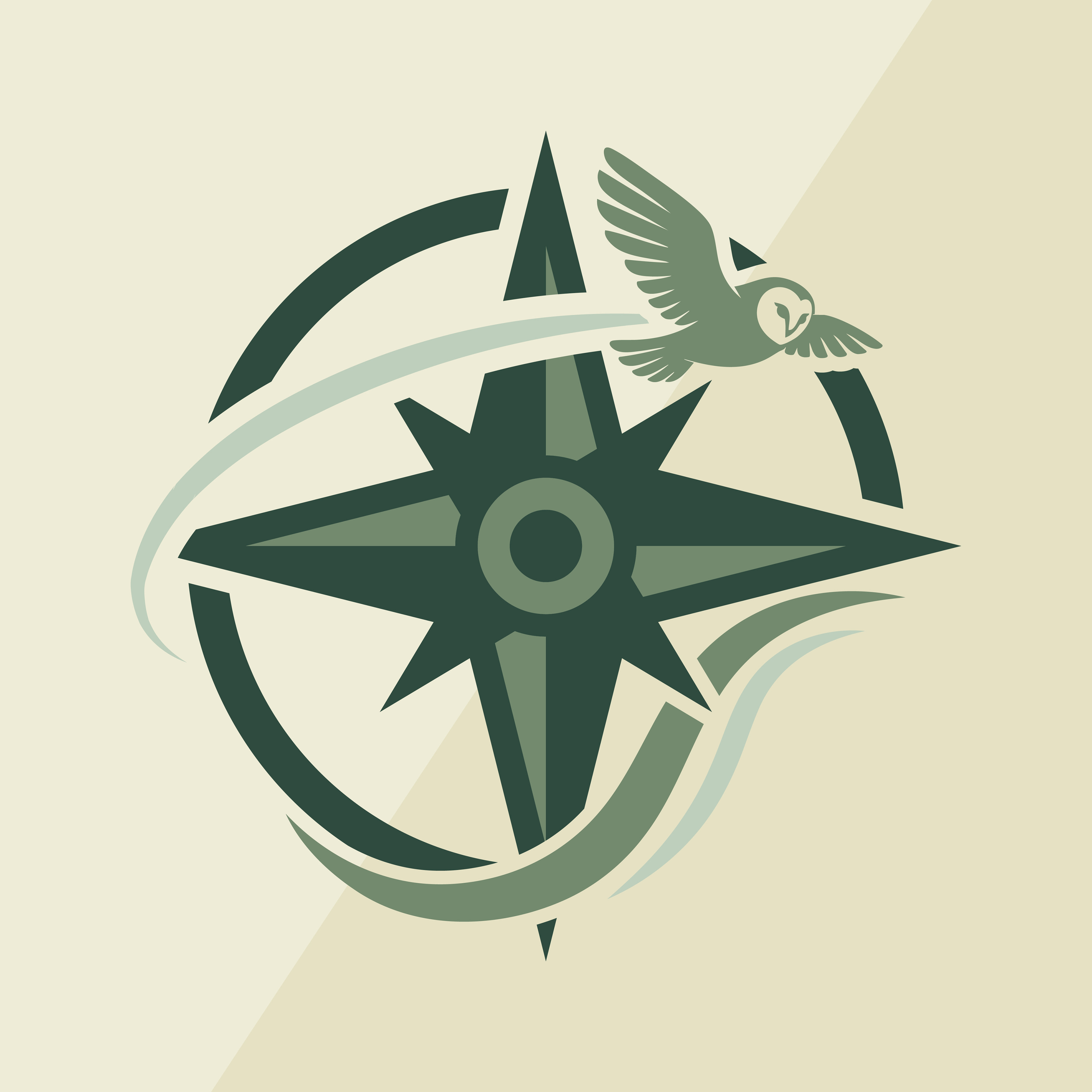
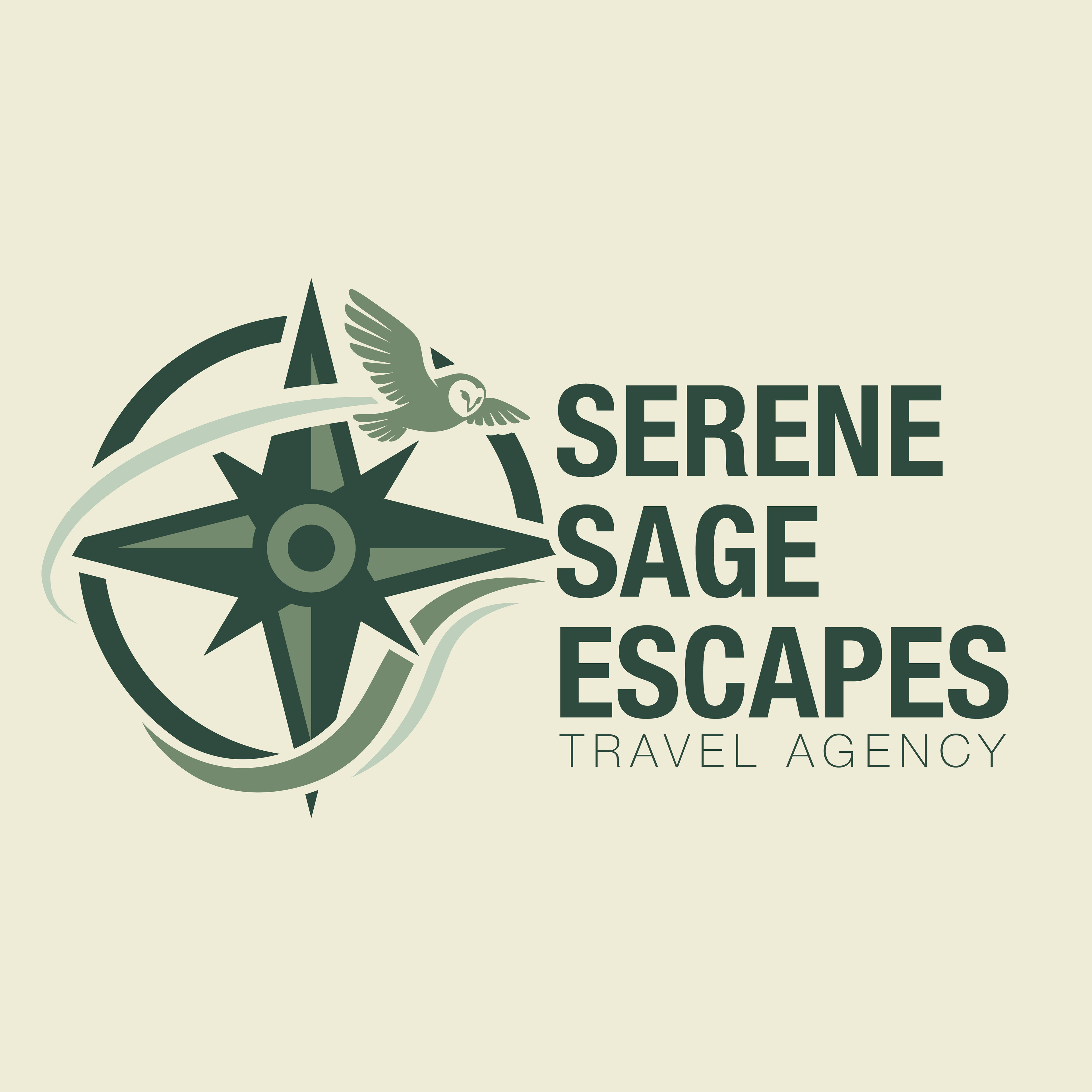
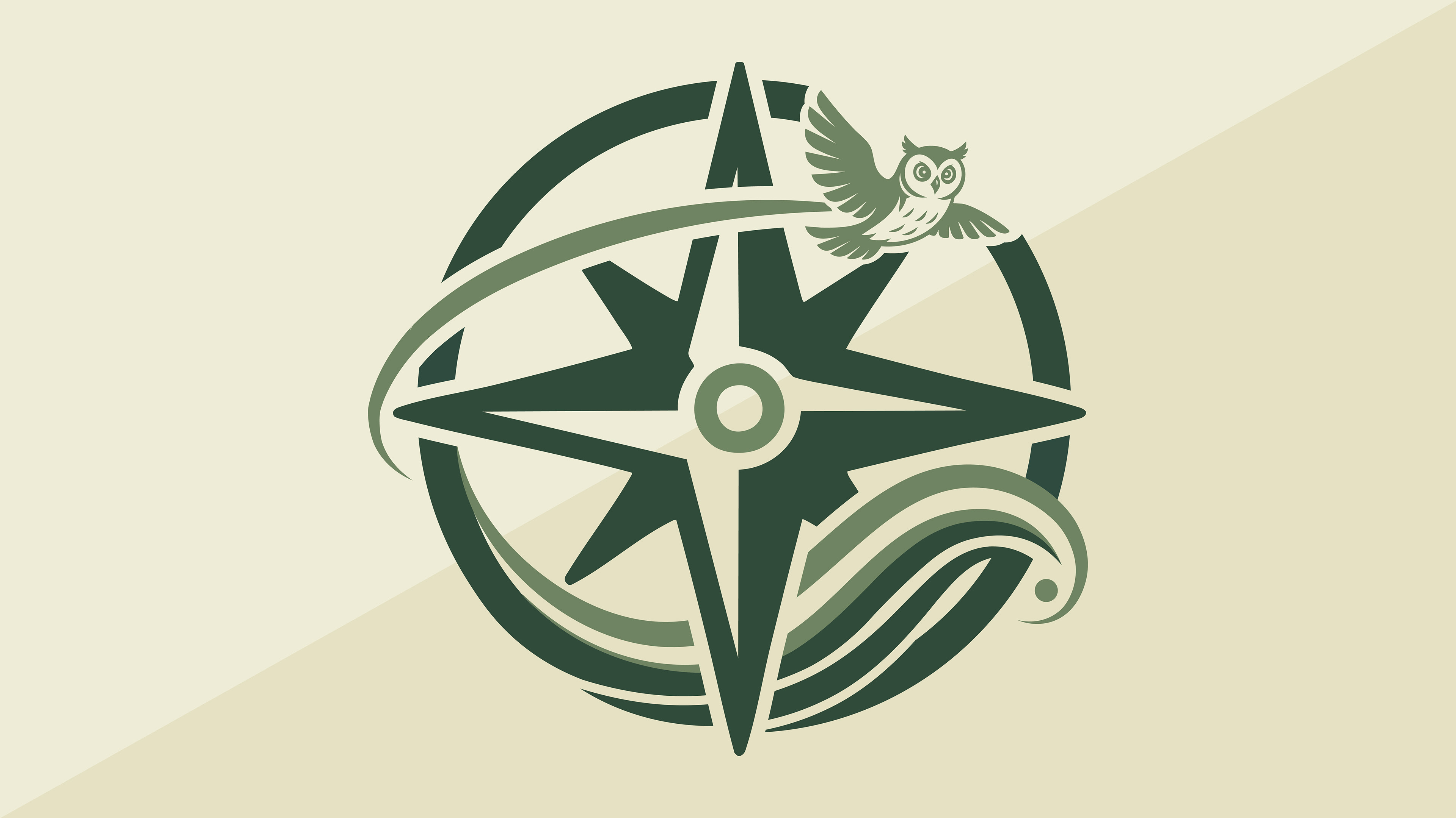
In the final design, I integrated her feedback to create a cohesive, versatile brand mark. I illustrated a horned owl in motion, symbolizing wisdom, freedom, and national reach. The owl arcs gracefully over a bold compass, visually guiding the viewer while the wave element anchors the design in calm, fluid movement. The typography was updated to a soft, rounded font to balance the emblem’s structured geometry.
The result is a polished logo that blends symbolism, movement, and harmony—perfectly reflecting the serene yet adventurous identity of the brand. I also delivered a secondary logo variation optimized for letterhead, merchandise, and digital use.